Thursday, 19 June 2014
And squint!
Another one of my tools I have used throughout this art course is our eyes! Yes we have used our eyes! We use them not to just look into the mirror while drawing self portraits or to look at the colours on our colour wheels. Another way we can use them is to squint. Squinting is useful when your drawing with conté. Once you loom in the mirror and see what is there if you squint it makes drawing easier and you can see almost like a black and white photocopy. It helps to block bright, neon, sparkly colours out. (Don't forget the boring ones too!!!)

Final Days
Tomorrow is the final day for our gallery. Also the first day of our exams. Next week our gallery will be taken down, and school will be over. This year in art has been an enlightening experience. It is very different compared to grade nine studies. Grade ten art has been a little harder, but my art skills have come farther than what I was in grade nine I believe.
Below is a picture of my artwork in the gallery.

Below is a picture of my artwork in the gallery.
Saturday, 7 June 2014
Oil Pastels
The past two weeks in art class we have been using oil pastels.
 |
| Like this package of oil pastels |
The first thing we did with the pastels was make a colour wheel. For the colour wheel we were only aloud to use the colours red, blue and yellow.
 |
| Our colour wheels looked like this slightly. For ours we went all the way in and made pizza like triangles. |
After we made our colour wheels we made portraits of ourself with two complementary tertiary colours. For mine I choose red-violet and yellow-green.
 |
| This is the type of art we did with our pastel portraits. Except for ours we only used one picture and two tertiary colours. |
Friday, 6 June 2014
Gallery
Next week in art class our class is holding a showcase in the gallery. Through the week students and teachers will be able to take a walk and look at the self portraits, and sculputres.
List of all of the projects:
- Conte drawing
- Oil pastel drawing
- Space sculptures
List of all of the projects:
- Conte drawing
- Oil pastel drawing
- Space sculptures
Sunday, 1 June 2014
let's talk about TEXT baby!
"Text is image, image is text"
Text styles are created everyday by individual stylists.
Body copy is meant to be read in large chunks. It is found in novels, newspapers, etc.
Leading: is the amount of vertical space from the baseline of one line of text to the Baseline of the next line of text
Kerning: Adjusting the space between two letters.
Bold: is a typeface with thicker strokes than regular. It is used for emphasis to make certain words and phrases stand out from surrounding text.
Italic: a style of typeface in which letters are slanted to the right. Italics are most commonly used for the titles of works that stand by themselves, such as the names of books and magazines.
Legibility: The quality of being clear enough to read
Script: the letters or characters used in writing by hand; handwriting, especially cursive writing
Typographic Ligature: in writing and typography, a ligature occurs where two or more graphemes or letters are joined as a single glyph
Grapheme: the smallest meaningful contrastive unit in a writing system
Saturday, 31 May 2014
Mirror, Mirror in my hand!

One of the many tools we have work with all semester is a mirror (like the one shown on the left). For the mirror we had to hold it in front of our face, not lower nor higher. How we would draw what we saw was by looking at your face, then drawing what you saw, not what you knew.
Interview
Right now in our grade 10 art class were are starting to prepare for our self portrait process reflection interviews. During our time in art class we have been developing our self-portrait drawing skills. We have work with multiple tools including:
- A mirror
- Ned/Nancy Normal (proportions of the human head diagrams)
- Art history references to self portraiture (ex. Van Gogh, Schiele, Rembrandt, Picasso)
- Photographs of our own heads from three different views
- Computer research on artists and text styles intended to express meaning through language and style.
THE INTERVIEWS START MONDAY AND END ON WEDNESDAY
Four Colour Printer
In a four colour printer Cyan, Magenta, Yellow and Koal (black) are the only colours used.
 |
| This picture shows the four colours that are used in a colour printer |
 |
| This is a picture showing how the four colour process works. |
 |
| This photo is showing how the colours we think we know are made up of Cyan, Magenta, Yellow and Koal. |
Tuesday, 20 May 2014
Conté and Chalk Drawings
In the pictures below chalk an conté are the materials being used.


 In this drawing the material used was chalk. There is a difference between chalk drawings and conté drawings. The difference is you can't work highlights and/or very many low lights into the drawing.
In this drawing conté and chalk are the friable materials being used. The darker spots, low lights, are done by conté. The lighter spots, highlights, are made with chalk.
In this drawing the conté being used is brown. In class we are using black conté. This drawing is alike to the previous, but with the difference of the highlights. The difference is that there are not as many highlights.
Out of the outcome from these three drawings I think that the best material for drawing out of conté and chalk is conté.
Sunday, 18 May 2014
Drawing Materials
The pictures down the middle are all materials we are using right now for creating our self portraits.
 |
| Blending Stomp |
 |
| Graphite Stick |
 |
| Conté |
 |
| Chalk |
Text, Text, Text!
This photo below is very good examples of what you can use each type of font for and what they mean.
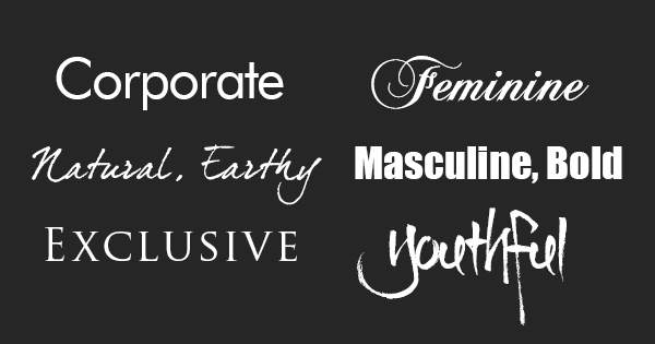
- The corporate font can be used for corporations and shows how they mean business.
- The natural, earthy font can be used for things that are natural, earthy, or things that you can use in nature or in the earth. If it is used for this purpose it shows how you/ it is free and caring. Just natural.
- The exclusive font can be used for exclusive places. Some examples are the VIP section, or a red carpet event, even a black tie event or gala. This font shows how it is exclusive and expensive places.
- The feminine font looks like it is lace and girly. It also looks as is it just came off of an add for something elegant and female. It can be used for elegance and feminine things.
- The masculine, bold font shows almost like domination and power. This font can be used to get a point across very clearly.
- The youthful font shows a fun, playful side of things. This font can be used for any marketing that is generated towards kids. An example of a good place to use this font would be toys or children's snacks.
Friday, 16 May 2014
Playful Portraits in Charcoal
Making Notes: Making notes is when you add lines or dark/light shapes in a charcoal drawing showing where you are going to end or add more colour. (ex. Ned/Nancy normal lines)
Pushing: Pushing invloves a harder touch to make the shape or image darker. It also can be moving the charcoal around.
Modelling: Modelling isn't standing and posing in front of a camera. This type of modelling is done with a good white eraser, white chalk or white charcoal. While modelling you don't press hard, but it is basically erasing or lightening the drawing you are working on.
Photo Copy Mode: Photo copy mode is when you are squinting at the person, object or picture you are drawing. Squinting down helps you see the shapes of darkness and lightness better then looking straight at it.
Describing: Describing is basically the negative space of the project being worked on. In the video we were shown The artist used negative space and made the face that was drawn standout alot more than if the negative space was left blank.
Not Symbols: Not symbols means that you shouldn't think about specifics. Yes you should think about what your eyes, nose and mouth LOOK LIKE, but not what you know about them.
Pushing: Pushing invloves a harder touch to make the shape or image darker. It also can be moving the charcoal around.
Modelling: Modelling isn't standing and posing in front of a camera. This type of modelling is done with a good white eraser, white chalk or white charcoal. While modelling you don't press hard, but it is basically erasing or lightening the drawing you are working on.
Photo Copy Mode: Photo copy mode is when you are squinting at the person, object or picture you are drawing. Squinting down helps you see the shapes of darkness and lightness better then looking straight at it.
Describing: Describing is basically the negative space of the project being worked on. In the video we were shown The artist used negative space and made the face that was drawn standout alot more than if the negative space was left blank.
Not Symbols: Not symbols means that you shouldn't think about specifics. Yes you should think about what your eyes, nose and mouth LOOK LIKE, but not what you know about them.
Friday, 25 April 2014
Art Space Sculpture
Below, is a picture of an idea I have been thinking about for my space sculpture.The idea is a train on rail road tracks. If I end up doing this sculpture it will consist of 5 parts.
Part 1: The last car, a circus
Part 2: The second last car, a coal car
Part 3: The second car, a passenger car
Part 4: The front car, the conducting car
Part 5: The bottom, the train tracks and grass

Part 1: The last car, a circus
Part 2: The second last car, a coal car
Part 3: The second car, a passenger car
Part 4: The front car, the conducting car
Part 5: The bottom, the train tracks and grass
Monday, 14 April 2014
Francis Bacon Self Portrait
Francis Bacon

The self portrait on the right was painted by Francis Bacon in 1971. The element of line in Bacon's self portrait is all organic. All of the lines are free and flowing. The shapes in Bacon's work of art 2-D. The organic 2-D self portrait looks like it has a texture of bumpy brushstrokes along the work. In Francis Bacon's self portrait the value is extremely dark. The negative space in this self portrait is the black area. The positive area is the head with all of the strange non-human colours. The colours in this work of art are dark and gloomy. The colours consist of blacks, grays, whites, and a little bit of orange and red. The dull colours show what Picasso never often did in his paintings. Therefore I think that's why it made its mark on history.
Vincent Van Gogh Self Portrait
Vincent Van Gogh

The self portrait shown on the right was done by Vincent Van Gogh. The lines in the painting is hard but not jagged and rough. The lines are both organic and geometric. All of the lines are real in this painting there are no implied lines.The shapes in the painting are all 2-D.The texture of the painting looks rough and bumpy where all of the painted lines are. The value in the self portrait is minimal. On him Van Gogh there is value but the area around him has none. Space in this painting would have to be half negative and half positive. The negative area is the lighter green and yellow area around Van Gogh and the positive area is Vincent himself. The colours in the painting are brighter colours, such as greens and yellows and whites. There are also some darker colours such as darker greens and blacks.
Wednesday, 9 April 2014
Gothic Cathedrals
Gothic Cathedrals
 The Gothic Cathedral, Reims Cathedral (shown right) in France, originates from the 12th century. Riems Cathedral was created using gothic architecture.

The Gothic Cathedral, Reims Cathedral (shown right) in France, originates from the 12th century. Riems Cathedral was created using gothic architecture.
The outside of the cathedral has such intricate designs.
The inside of the cathedral also has very intricate designs. The giant stained-glass is a marvelous work of art to put into a gothic cathedral. The ceilings are also very high and have extremely inticate painings.
Friday, 4 April 2014
Giorgio DeChirio
Giorgio DeChirio


These two pictures above are paintings by an Italian painter Giorgio DeChirico. He was born in Volo, Greese in 1888 and later died in Rome, Greese in 1979. Giorgio was a painter, sculputer, theatrical designer and a writer. The top painting is called The Uncertainty Of The Poet and was created in 1913. The mood in The Uncertainty Of The Poet is set by the sculpture and the fallen bananas. This sets a mood of depression yet mystery. I think that beause the sculpture is set in such a way that is makes it look like it is hiding something deep, and the fallen bananas on the ground make it look depressing like someone left them there to die with the mystery sculpture. The bottom painting by Giorgio is called Piazza d'Italia and was also created in 1913. Piazza d'Italia in English is Piazza of Italy. The mood in Piazza d'Italia is set by the the colours. The colours set the mood to be happy and warm. They make the painting feel like the sun is rising, so it makes me get this warm, fuzzy, inviting feeling inside my stomach.
Monday, 31 March 2014
Space
Space refers to the distance between, around, or within a component of art. Space can be positive WHITE OR LIGHT or negative DARK OR BLACK. Space can also be open, closed, deep, shallow, 2D or 3D. Occasionally space isn't in a piece of art but only in the illusion. Space sets the mood in a piece of art.The painting below by Michelangelo in the Sistine Chapel is a great example of space. The space between God's finger and Adam makes the painting feel more suspenseful.

To perceive space you can use all 5 senses or these 3 major ones.
- Sight
- Sound
- Touch
For sight you can see the depth, the light or dark, open or closed.
For Sound you can hear nothing, an open space with nothing around (farm) or a lot of talking, bigger space with more people but less room (arena)
For touch you can feel how big the area is around or between things.

This clocks painting above by Salvador Dali has a good use of space. The space is used good because it sets the mood and makes feel lazy, almost as if time is going really slowly. It also makes you feel as if your trapped in time, no way to get free.
So essentially space is the positive or negative space around or within a component of art. It could also be referred to as the free space around or within a work of art.
Monday, 24 March 2014
Grid Transfer
Right now in art class we are doing a grid transfer drawing of a skull.This picture below shows how a grid transfer slowly transforms from a grid to a beautiful value drawing. The first box in the picture is the actual picture that was used as a picture to draw. The 2 and 3 are of the grid drawing starting and in progress slowly working through the boxes. The last photo is of the dog finally finished. If you look very closely you can tell where the lines use to be for the grid.

Tuesday, 25 February 2014
Blind Contour
Right now in our art class we are working on blind contour. Blind contour is a continuous line created on paper without looking down.

<This picture is a good example of a blind contour. The way you can tell this is blind contour is by the overlapping lines, and the are not in normal places. That is why this is a good example.

Thursday, 20 February 2014
Look at things differently

This is perfect for art. Sometimes you need to just look at things in a different light or perspective. Art relates to this because you have to be creative and use your imagination to create beautiful works of art. So we should all try to look at things differently.
Wednesday, 12 February 2014
Greek Sculptures


These two sculptures are kouros from the archaic period in Greek history. The picture on the left side is a women also called a kore sculpture. The one on the left is a male and called a kouros. Their simple body structure shows that they were from this period in time because the body is thin and doesn't show much anatomy. The faces show no emotion looking mask like.


These two pictures are of a classical Greek athlete and the goddess Aphrodite sculptures. The discus thrower on the left shows more anatomy then the archaic Greek kouros. You are beginning to see muscle. On the right side is a classical Greek sculpture of the goddess Aphrodite. You can see a lot more anatomy then the archaic kore sculpture. The goddess sculpture has more anatomy and muscle sculpture. The drapery around her hip area shows that sculptures are now getting more intricate with time.

This picture on the left of a headless angel is from the Hellenistic era. the drapery, muscle tone, and over all sculpture work is much more sophisticated than the Archaic period sculptures. You can't really see any anatomy but the drapery is close to a wet t-shirt contest the way it looks very thin and almost no existent.
Subscribe to:
Posts (Atom)