Saturday, 31 May 2014

Mirror, Mirror in my hand!


One of the many tools we have work with all semester is a mirror (like the one shown on the left). For the mirror we had to hold it in front of our face, not lower nor higher. How we would draw what we saw was by looking at your face, then drawing what you saw, not what you knew.


Interview

Right now in our grade 10 art class were are starting to prepare for our self portrait process reflection interviews. During our time in art class we have been developing our self-portrait drawing skills. We have work with multiple tools including:
  1. A mirror
  2. Ned/Nancy Normal (proportions of the human head diagrams)
  3. Art history references to self portraiture (ex. Van Gogh, Schiele, Rembrandt, Picasso)
  4. Photographs of our own heads from three different views
  5. Computer research on artists and text styles intended to express meaning through language and style.
THE INTERVIEWS START MONDAY AND END ON WEDNESDAY

Four Colour Printer

In a four colour printer Cyan, Magenta, Yellow and Koal (black) are the only colours used.  

This picture shows the four
 colours that are used in a
colour printer

This is a picture showing how the four colour process works.
                                     

This photo is showing how the colours we think we know are
made up of Cyan, Magenta, Yellow and Koal.


Tuesday, 20 May 2014

Conté and Chalk Drawings

In the pictures below chalk an conté are the materials being used. 

In this drawing conté and chalk are the friable materials being used. The darker spots, low lights, are done by conté. The lighter spots, highlights, are made with chalk. 

In this drawing the conté being used is brown. In class we are using black conté. This drawing is alike to the previous, but with the difference of the highlights. The difference is that there are not as many highlights. 

In this drawing the material used was chalk. There is a difference between chalk drawings and conté drawings. The difference is you can't work highlights and/or very many low lights into the drawing.

Out of the outcome from these three drawings I think that the best material for drawing out of conté and chalk is conté. 

Sunday, 18 May 2014

Drawing Materials

The pictures down the middle are all materials we are using right now for creating our self portraits.

Blending Stomp
Graphite Stick

Conté

Chalk

Text, Text, Text!

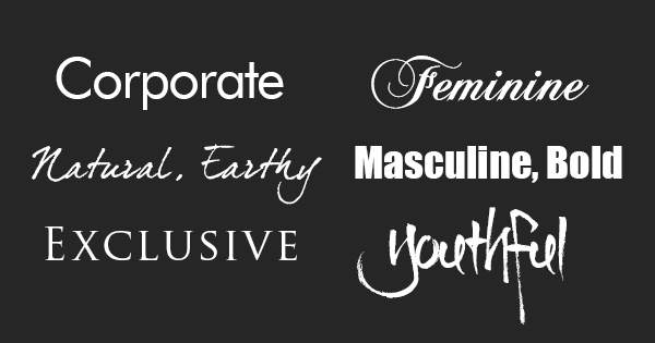
This photo below is very good examples of what you can use each type of font for and what they mean.


  • The corporate font can be used for corporations and shows how they mean business.
  • The natural, earthy font can be used for things that are natural, earthy, or things that you can use in nature or in the earth. If it is used for this purpose it shows how you/ it is free and caring. Just natural.  
  • The exclusive font can be used for exclusive places. Some examples are the VIP section, or a red carpet event, even a black tie event or gala. This font shows how it is exclusive and expensive places.
  • The feminine font looks like it is lace and girly. It also looks as is it just came off of an add for something elegant and female. It can be used for elegance and feminine things.
  • The masculine, bold font shows almost like domination and power. This font can be used to get a point across very clearly.
  • The youthful font shows a fun, playful side of things. This font can be used for any marketing that is generated towards kids. An example of a good place to use this font would be toys or children's snacks.

Friday, 16 May 2014

Playful Portraits in Charcoal

Making Notes: Making notes is when you add lines or dark/light shapes in a charcoal drawing showing where you are going to end or add more colour. (ex. Ned/Nancy normal lines)

Pushing: Pushing invloves a harder touch to make the shape or image darker. It also can be moving the charcoal around.

Modelling: Modelling isn't standing and posing in front of a camera. This type of modelling is done with a good white eraser, white chalk or white charcoal. While modelling you don't press hard, but it is basically erasing or lightening the drawing you are working on. 

Photo Copy Mode: Photo copy mode is when you are squinting at the person, object or picture you are drawing. Squinting down helps you see the shapes of darkness and lightness better then looking straight at it. 

Describing: Describing is basically the negative space of the project being worked on. In the video we were shown The artist used negative space and made the face that was drawn standout alot more than if the negative space was left blank.

Not Symbols: Not symbols means that you shouldn't think about specifics. Yes you should think about what your eyes, nose and mouth LOOK LIKE, but not what you know about them.